Melissa Milloway | November 11, 2016

I have an ever ongoing love/hate relationship with corporate learning.
I love creating learning products. However, I absolutely cannot stand having to use poorly designed/developed learning products.
E-learning products can be effective, have a good user experience, AND look like they don’t come from 1999 (in a not so good way.)
When I learn on the go, I want it to be a shorter experience and easy to use. I don’t want to spend 5 minutes trying to click on a button that is too small for the screen.
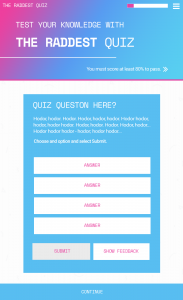
This weekend I set out to create a one page quiz using the Adapt Framework. I wanted to create a mobile friendly quiz with a retro feel (think 1999, in a good way.)
Check out the quiz here on your phone or laptop.
The quiz is responsive and if it were hooked up to an LMS I could adjust the settings to see how people answered the questions.
The details/resources
The quiz was created with the Adapt Framework.
You can learn about getting started with the Framework from one of my other posts.
- Responsive single paged quiz
- Ability to toggle between SCORM 2004/SCORM 1.2
- Mock up created in Photoshop
- Lorem Ipsum used as placeholder text is Hodor Ipsum
- Background is from Subtle Patterns
- Header has an animated gradient
- Font combo is Space Mono and Roboto from Google Fonts
Are you interested in using this styled quiz? Let me know on LinkedIn, I will work to make it available.
This post was written by Melissa Milloway and originally appeared on LinkedIn: I created this rad, one page, mobile friendly quiz in a weekend

